|
|
Contrast Design of Visual Tone
Keeping an eye on the creation of visual contrasts will help you generating well-designed maps. If these most important visual contrasts are missing, the map user will lose interest in the map. A further consequence of missing contrasts is the difficulty in distinguishing between important and unimportant elements. The goal of contrasting elements is to emphasize perceptible differences and to give the eye the ability to discern them. Contrasts are achieved by modulating several visual variables: line, texture, value and colour. Below we suggest a few general principles of contrast:
Line Contrast
Lines are everywhere on a map: borders, neatlines, boundaries and symbols, for example, are very important map elements. Thereby,
the need for well considered line contrasts emerge. There are 4 different possibilities for creating line contrasts that need
to be taken into consideration when defining lines.
Have a look at the following specification:
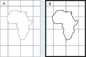
Line Characters |
|
For creation of well designed maps, line characters are not used in the same way as line widths. Indeed, a large line is visually dominant and brings more intellectual importance than a variable line character. Try to have different line characters and line widths on your map: a map with all lines of one width is boring and lacks potential in figural information.
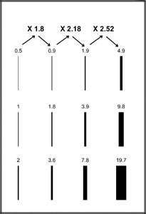
Do not overdo it with variations – they may confuse the map user. Stick to one line width within one information group! Have a look at the following rule from Richard D. Wright. It may be of help if you are confronted with choosing line widths to assure noticeable differences in maps.
 Rule of Richard D.Wright Rule of Richard D.Wright |
Rule of Richard D. Wright (according to Wright (1967) cited in (Dent 1999))
|
Texture Contrast
Texture is often chosen to represent quantitative or qualitative information, but without any contrast consideration. What
is contrast of texture about? Contrast of texture involves areal patterns of small symbols. They are repeated in such way
that the eye can perceive the individual elements and are chosen for different reasons:
- Patterns can be used on a map solely to provide graphic contrast
- Texture is sometimes applied in order to direct the reader’s attention to a particular part of the map.
Colour Contrast
The most applied technique in the designing process is to make use of colour contrasts. They are of major importance, as its
impression has an immediate affect on the user. Colour contrasts and colour in general, as they are a major design element,
are treated in detail within the Colour Design unit.
All mentioned principles of design contrasts could be used within one project layout but the result might be visually disharmonious
or might appear without contrasts at all.
Designing with contrasts requires careful juggling with lines, textures, and colour-characteristics. It is a subtle element
to use economically and with care. In the beginning, much may be generated by trial-and-error, but in most cases, you will
see intuition to be explainable by designing rules. Then you will choose the right combination built up on your experience
and knowledge.

