Depiction of intervals
In contrast to the continuous depiction of quantities, the depiction of intervals requires the separation of the underlying values into data classes. This classification, however, results in information loss. For this reason, the depiction of intervals should be only used as a secondary option after the continuous depiction of quantities. According to Spiess (1995), the depiction of intervals can make sense in the following cases:
- If the quantities are only approximately known
- If huge disparities between extreme values exist, which would make it difficult to depict all values continuously
- If very small differences of the values exist, which nonetheless should be highlighted clearly
- If the depiction of classes is desired in order to visualise the natural intervals
- If the magnitude of values is greater than the exact values
- If the values should be depicted in a simplified manner
Similar to the case of the continuous depiction of quantities, the depiction of
intervals can likewise be subdivided into a proportionally graduated variant and an
arbitrarily graduated variant.
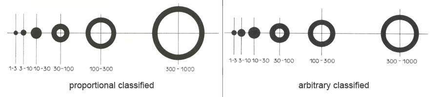
The data to be depicted and their spreading form the basis for the choice of which variant is to be used.
The following chapter deals with the intense and the graduated depiction of quantities. Afterwards, the classification steps are discussed.
Data analysis for the depiction of intervals
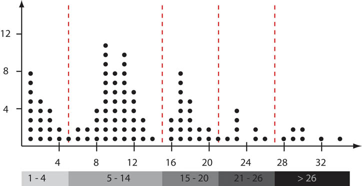
The simplest method to analyse statistical data is called line lists. These can then be visualised using a frequency diagram. Frequency diagrams form a good basis to classify the data in a next step. The following visualisation depicts a frequency diagram included possible class boundaries (red).
General information on classification
The number of classes, the class boundaries as well as the width of the interval play an important role in classification. The map image and the statement of the map depend on the choice of these parameters. Therefore, care has to be taken during classification. The following rules should then be followed:
- The classes among each other should preferably be different.
- The data within each class should be as similar as possible.
- Clusters and extreme values should become visible or remain visible.
- If it is sensible to do so, uniform class sizes should be aimed for.
- Class widths should preferably be chosen in such a way so that each class should be occupied more than once. Exceptions are the boundary classes.
- The whole value range of the attribute has to be represented and depicted.
- Natural boundaries should be preferably taken into account and should be considered as class boundaries.
Number of classes
The number of classes depends on the size of the dataset as well as on the signature which should represent the attribute. A too big number of classes, therefore, does not yield the necessary generalisation of the data. If the number of classes is too low, many information vanish due to generalisation. The exact number of recommended classes varies depending on the point of view. From the viewpoint of a statistician, 6 to 8 and 10 to 12 classes for single-coloured and multicoloured visualisations are recommended (Quitt 1997). From a cartographer's viewpoint, 3 to 7 classes are recommended according to Imhof (1972).
Click here to enlarge the animation.
Class boundaries and interval widths
The most important criterion, which is to be considered during classification are the original data. Depending on their distribution different class sizes and interval widths are suitable. In general, classification can be performed according to the following principles:
- Classification according to groups with a common meaning
- Classification according to groups of frequencies
- Classification according to mathematical rules
The following interaction shows the three principles.
Further information on classification in general and the methods for classification according to mathematical rules in particular can be found in the GITTA lecture Statistics for Thematic Cartography in Chapter 1.2. and 1.3. The pdf version can be found here.
Examples for graduated depiction of quantities
Graduated depictions of quantities can be used for data of nominal, ordinal and metric scales. In addition, absolute and relative values can be depicted. In the following interaction, three examples are shown of how different data can be mapped after classification.
|
|
|
|