Depiction of datasets
For the depiction of datasets with multiple attributes diagrams are used.
Usually, these attributes make up a superordinate attribute which is divided into
multiple subordinate attributes. These attributes can contain either relative or
absolute values. One example of such a dataset would be the absolute number of
employees, divided into the three economic sectors.
In general, diagram maps can be subdivided into diagram maps where the diagrams
refer to single points and those where the diagrams refer to areas. Sound
information concerning these map types can be found in the respective chapters.
In the following text, first the most important diagram types are discussed and
afterwards the choice of the design of the diagrams independently of the type of
the diagram map is described.
Types of diagrams
There are uncountable forms of diagrams which can be used for their depiction in thematic maps. Many of these forms can be derived from the following four types:
- Pie charts
- Wing chart
- Bar chart
- Area chart (e.g. squares)
The following visualisation shows examples of these four forms of diagrams.
Choice of the diagram type
The decision for a diagram type depends to great extent on the type and characteristics of the data to be depicted. During a first selection, those diagrams are determined which are in principle suitable to represent the given shape of the data. In a second step, the focus lies on the characteristics of the data.
Raw selection
Depending on the dataset, diagrams have to fulfill certain requirements such as the possibility to (Spiess 1995).
- Compare total quantities
- Compare subsets of different diagrams
- Depict zero sets
- Compare subsets with the total quantity
- Potentially depict negative values
The following table gives an overview over the properties of the four
most important diagram types. It allows to determine which diagrams can
generally be used to depict a dataset.

Detail selection
After this first overview on diagrams it is now to be determined which of the remaining diagrams is most suitable to depict the dataset. It has to be investigated if the variation of the data allows for a suitable representation. This means that the smallest diagrams should not fall below the typical minimal values and the biggest diagrams should not occlude the map disproportionately. To estimate if these criteria can be met with the chosen diagrams, the data spread has to be calculated and the diagram scale has to be selected. These values can then be used to compute the area spread.
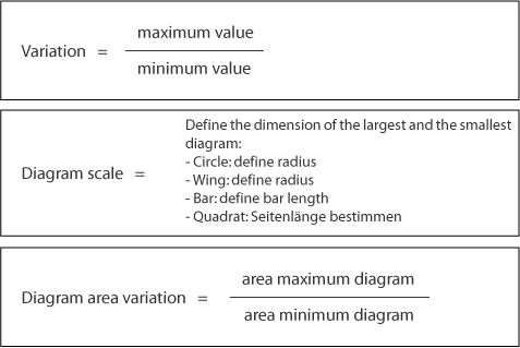
The comparison of the data spread with the following limits allows to determine if the chosen diagram is suitable.
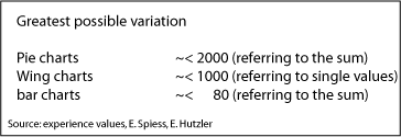
If these limits are exceeded, the diagram is not considered to be optimal
for the depiction of the dataset. If these data only contain few outliers for the
extreme values and the diagram type would actually be suitable, it is possible to
treat extreme value diagrams separately. Detailed information on this topic can be
found in the chapters on diagram maps.
In a next step, the
data spread and the area spread are to be compared. If these values are very
different, another diagram type should be used.
Diagram design and diagram placement
After the decision for a diagram type has been made, it has to be decided how to represent the data in the diagram and how to place the diagrams in the map. The following sections deal with the function of representation, minimum dimensions for diagrams, reference points and placement of diagrams.
Function of representation
The function of representation defines how the data are represented in the diagrams. Analogous to the representation of single attributes it has to be decided if the data is represented continuously or stepwise and if proportional or not. The aim should be a continuous proportional representation which allows a high density of information. If the spread of the data does not allow this one can refrain from the recommendation. One has to be aware that the map reader may misinterpret the map in this case.
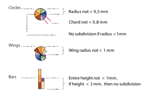
Minimum dimensions of diagrams
To enable the map reader to easily read the presented information and to guarantee a good map readability, there are also minimal dimensions for diagrams. The following image shows reference values which have been determined empirically over time.
Reference points of diagrams and placement
Each diagram has at minimum one reference point. The diagram can be aligned to this point. Depending on the map type the diagrams are placed at a certain point or within a certain area.
The following interaction shows possible reference points for square-, pie- and bar charts.
If the placement is done automatically, the diagrams are usually placed regarding the same reference point. The result has normally to be modified manually to gain a high cartographic representation quality.
The following interaction shows three typical problems which occur after an automatic placement. Think about how the placement could be improved.
|
|
|
|