|
|
Digital Mapping Specificity
Digital Mapping Limitations
The visual limitations of the computer monitor are immediately apparent when compared with a finely printed image. Until computer screens get closer to producing images as fine as on paper, you have to use new techniques and overcome these limitations by seeking solutions through innovative map design. We are going to depict here the restrictions of digital map display, but above all see how to overcome them with adapted design techniques.
Screen Dimensions
While nowadays most desktop computers are capable of displaying 1280 by
1024 pixels with 32-bit colour, the default settings on these machines out of
the box are usually 1024 by 768 or even 800 by 600. The average user will not
change this, so you are forced to design digital maps with the low-resolution
user in mind.
With limited resolution, many designs can end up looking
clunky. A judicious use of colour can minimise some of these problems along with
concise data selection and deliberate typography.
Overall the best way to make digital maps clear and readable is to reduce the map elements shambles.
Pixel size and screen resolution.
Discover how screen size, pixel number, and resolution are interrelated by pushing the three buttons with your mouse.
Screen colours
Computer monitors are poor imitators of nature. Indeed, the additive colour space of RGB (Red Green Blue) does not come close to covering the gamut of colours perceivable to the human eye. Furthermore, you might be surprised by the colour restitution when viewing your map on a different computer. In fact, colours are not rendered in the same way on different monitors.
The following hardware related reasons can be identified:
- According to www.thecounter.com, around 3% of all clients surf the web with a monitor set to display only 256 different colours (8-bit), 40% view web pages with thousands of colours (16-bit High Colour), and the rest uses millions of colours (24 or 32-bit True Colour).
- There are differences in the quality and design of the hardware between monitors of different manufacturers and different types (CRT or flat screen).
- The age of the monitor; different monitor adjustments (brightness, contrast, colour, temperature, etc.); and the ambient light.
Other reasons are software related:
- Operating systems use different gamma curves. This mathematical function maps RGB colour values to voltages of the display card. The gamma value mainly influences the brightness of the image. Colours on a Windows PC appear darker and more intensive (gamma value of approximately 2.2) than on a Mac (gamma value of 1.8).
- Different web browsers and plug-ins can interpret colour values differently.
You cannot foresee any of these factors. The following recommendations can at least partially solve this problem:
- Design your graphics for the most widespread combination of operating system and web browser used by your targeted audience. Currently, around 90% of all web surfers use a combination of some variant of Microsoft Windows and Internet Explorer (www.thecounter.com).
- Determine whether systems with only 256 different colours must be supported. This may be a requirement, if an important part of the targeted audience originate from southern countries. If support for 8 bit systems is not needed, ignore the web-safe colour palette that was very useful with Internet Explorer and Netscape Navigator a few years ago.
- If the majority of your audience uses Microsoft Windows to view your digital map, you should adjust your monitor to simulate an average office PC with a mediocre screen (gamma value of 2.2, with millions of colours); and use the RGB colour space if supported by your graphics software.
- Clearly differentiate colours for thematic mapping, i.e. use larger colour contrasts for screen maps than for paper maps. The reason is again the unpredictable colour rendering: Two close colours might appear very distinctive on a certain screen, but might be hardly discernible on another. To better differentiate succeeding thematic classes with grades of colour, you may also reduce their number.
Some general advice concerning colour design for digital mapping:
- Always preview your map at various resolutions and bit depths, and when possible on different monitors.
- As much as possible, try to find muted or light colours.
- Do not feel the need to use black for all labels; try a dark maroon or a muted dark blue instead.
- Use colours close in value to each other to make some map elements recede to the background.
- Look for colours in the same basic hue range to tie themes together.
- Avoid saturated colours of different hues that are close in value, as they will produce visual vibration.
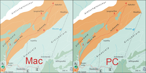
Colour differences between Mac and PC
The following pictures show you the colour differences between Mac and PC operating systems.
On the left, the map viewed on a Mac screen seems to be lighter then the map viewed on a PC screen (on the right).
Screen and antialiasing
For screen display, vector data are converted to raster images. Simple algorithms used for rasterizing vector data create an aesthetic step effects in edges. The “antialiasing” correction consist relatively complex mathematical operations that create semi-transparent transitional borders at the edges of objects and thereby produce a more appealing appearance. However, the conversion process from vector data to raster image is much more time consuming when antialiasing is used.
Antialiasing on a map.
The following pictures show you the difference between a map exerpt with and without antyaliasing. The readability of the map without antyaliasing (left) is not very good, whereas the right map with antyaliasing is easy to read.
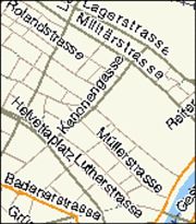 Excerpt from MapQuest’s web map of Zurich without antialiasing (mapquest) Excerpt from MapQuest’s web map of Zurich without antialiasing (mapquest) |
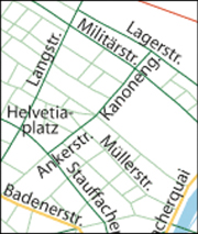 Same excerpt with antialiasing (rendering with Adobe Illustrator). Same excerpt with antialiasing (rendering with Adobe Illustrator). |
Screen and fonts
The selection of an appropriate font for a web map is a difficult task, since a balance between often contradicting criterions has to be found. Therefore, you have to analyse existing fonts for their suitability to be used for web maps. As for paper maps, a font must be easily legible and should also be optically pleasing. You can find some further information concerning fonts for digital mapping in the unit “Typography” of the lesson “Layout Design” (Basic Module).
Font effects on a digital map.
Discover in the following animation some useful advice for choosing the adequate font for your digital map.
Screen and minimal dimensions
The symbolisation of graphical objects for digital maps has to be adapted to the peculiarities of screens. Line widths, minimum sizes for point symbols and minimum distances between graphical elements have to be larger than on paper maps in order to be optically well discernible. This is a consequence of low screen resolution and the use of antialiasing.
Reference values for sizes and distances will be suggested in the following paragraph. However, the suggested values do not replace visual control of the map when displayed with the respective software program or plug-in. The future will certainly provide us with better monitors, improved browsers, and more advanced viewer technologies. Therefore, you must constantly update your knowledge.
Lines width on the screen
Sometimes, you might be surprised not to see the expected difference of the width of two lines on the screen. Indeed, the quality of the antialiasing algorithm can differ between distinct graphics programs and browser plug-ins. The following example shows Bézier curves with increasing width rendered with by the Macromedia Flash Player and the Adobe SVG Viewer. The SVG Viewer on the left renders lines that are narrower than half a pixel more accurately than the Flash Player (on the right).
|
SVG Bézier curves
|
Flash Bézier curves (Jenny et al.)
|
Furthermore, with the Adobe SVG Viewer, line widths do not increase linearly, but grow irregularly. Lines between 0 and 0.14
pixel are always rendered with the same width and in grey colour. Between the pair’s 0.22/0.24 pixel and 0.3/0.32 pixel differences
of the apparent line with become recognisable. Other renders may have completely different characteristics.
Map design and screen
Because the distance the user keeps to the display device when studying a digital map is approximately 80 cm, whereas a paper map is typically held at a distance of only 30 cm:
- Distances between map elements and minimum sizes of signatures should be chosen larger rather then smaller.
- Information density should be adapted according to the enlargement of the symbolisation. Spiess recommends a reduction of the information density by a factor of 2 to 3.
- Since the entire map cannot be displayed on the computer screen in three times its size on paper, lines, areas and point signatures as well as text labels have to be adapted respectively.
- The geometry of map elements must be much more generalised for screen display.
Notice in the following example, the very distinctive density of information between the paper map and the digital map.
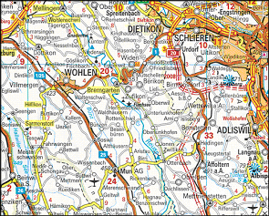 Traditional road map on paper (Kümmerli & Frey 2003) Traditional road map on paper (Kümmerli & Frey 2003) |
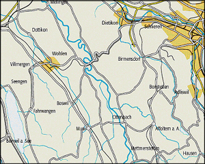 A similar map that was optimised for screen display. A similar map that was optimised for screen display. |
Discover in the following animation, the minimum dimension and the minimum distance in a digital map.

