|
|
![]()
Methods processing 2 time markers (2 limits)
In many situations the time dimension is only describe through the status of observation properties at the beginning and the end of the considered time period (tmin, tmax). Assuming a context of a univariate description of multiple observations, information can be structured as a two dimensional table with rows corresponding to observations and columns expressing the two time limits.
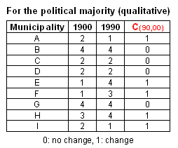
 Number of inhabitant and political majority in 1900 and 1990
As stated previously, property change can be considered either individually or globally among all spatial features or individually but relatively to the global behaviour of features.
Individual property change (comparison of the two properties):
As stated previously, property change can be considered either individually or globally among all spatial features or individually but relatively to the global behaviour of features.
Property difference (quantitative)
D index is the difference
between property value V at tmax and
tmin for each i spatial feature: 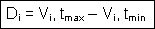
The normalised difference ND expresses the change rate
based on a reference time (often tmin)
for each i spatial feature: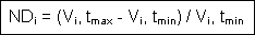
Property ratio (quantitative)
R index is the ratio between
property value V at tmax and
tmin for each i spatial feature: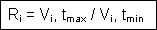
Another property ratio can be produced that allows
comparison between individual change rate and the global one (for the whole set
of considered features), Rtot. This
relative change rate index RRi
(Relative Ratio) is the ratio between Ri and Rtot: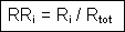
Change classification (qualitative)
C index expresses the type
of change between property value V at tmax and tmin for each
i spatial feature. C values can be simply binary (with 0 for no change and 1 for
change) or multiple to describe the type of change between the two considered
categories. C results from a classification process.
In the case of
nominal level content, C value is either 0 or 1 expressing a change or not.
However, for variables at ordinal or cardinal level, one might want to
differentiate between three situations of change: a decrease, no change and an
increase. The 3 possible values of C index could then be derived from the
classification (recoding) of Di values,
according to the following scheme:
Illustration
Let us apply this set of individual property change indices to the two
variable sets listed in Table above. The change of individual features
between the two intervals of time is described as follow.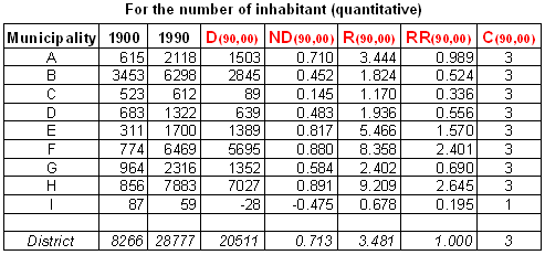
In the example it shows that Ri amplifies growth changes compared to NDi, but the reference value for a decrease is
now less than 1 (municipality I).
The spatial analysis of
behaviour change can then be carried on as a further step by making use of index mapping.
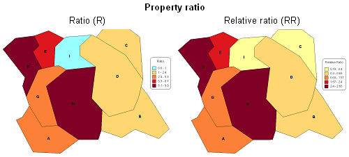
") Mapping of property change indices for the number of inhabitant (quantitative)
Mapping of property change indices for the number of inhabitant (quantitative)") Mapping of property change index for the political majority (qualitative)
Mapping of property change index for the political majority (qualitative)
Global property change:
One can be interested in evaluating changes among the whole set of spatial features.
Summary statistics (quantitative / qualitative)
Individual change indices can be summarised using appropriate central tendency and dispersion indicators. Of course only change indices relevant for comparison between features should be considered.
For quantitative change indices (ordinal and cardinal levels):
- Mean or median indicators, applied to the normalised difference index (ND) for example
- Standard deviation or interquartile of the normalised difference index (ND) values for example
- Median or mode indicators, applied to the change classification index (C) for example
- Interquartile or diversity indicators, applied to the change classification index (C) values for example
For qualitative change indices (nominal level):
- The mode, applied to the change classification index (C) for example
- The diversity index of the change classification index (C) values for example
These relevant central tendency and dispersion descriptors can then be
used for a relative description of individual change behaviour. At ordinal and
cardinal levels individual feature change can be compared to the global change
by grouping its change value into classes around the central
tendency:
- at ordinal level: interquartiles around the median;
- at cardinal level: standard deviation units around the mean value.
Scattergramme (quantitative)
Another efficient way for comparison of change between features is to plot them according to their individual properties for the two dates. This can be seen as a “time change map” with a pair of coordinates locating them into this two-dimensional space.
Such a diagramme allows different types of interpretation:
- comparison between observations: the distance expresses the level of similarity
- when adding the location of the central tendency (mean, median) and the variability (standard distance) to the diagramme, comparison can be performed between each observation and these references
- furthermore change behaviour references can be added to the graph in order to identify three types of change: growth, no change and decrease. These types of change correspond to three areas on the diagramme: on the diagonal, above and below.
Next figure illustrates the use of a diagramme representation for the
mapping of the 9 municipalities. Their change behavior can be compared to each
other as well as to global references (mean and standard deviation) and types of
change.
 Graphical representation of property change for the number of inhabitant using a scattergramme as a “time change map”
EXERCISE
On the last figure:
- identify groups of municipalities with a similar change behaviour
- identify municipalities away from the average behaviour. How do you interpret their position?
- Which municipality belongs to the “decrease” type of change?
- Compare the distance of each municipality position to the “no change” line. To what individual property change index listed in tables of the Illustration paragraph can it be best associated?
Transition matrices (qualitative /quantitative)
Now our interest is in the nature of transitions from one state to another. We can use techniques that sacrifice all information about individual observation properties but provide in return information on the tendency of one state to follow another.
Due to the use of a two dimensional cross-table, the number of considered properties is limited. This approach is fully adapted for qualitative data (categories at nominal level), but also for classes at ordinal level and even at cardinal level, assuming original properties are grouped into a limited number of classes.
Let us illustrate the exploitation of ![]() transition matrices with our data
set on Political majority of municipalities in 1900 and 1990 illustrated in
previous table. We would like to summarise the change from the property in 1900 to
another one in 1990. Furthermore we could identify the tendency of one property
to follow another.
transition matrices with our data
set on Political majority of municipalities in 1900 and 1990 illustrated in
previous table. We would like to summarise the change from the property in 1900 to
another one in 1990. Furthermore we could identify the tendency of one property
to follow another.
A 4 × 4 matrix (or cross-table) can be constructed showing the
number of times a given property –political majority- is succeeded by another, a
matrix of this type is called a transition frequency matrix and
is shown in the following table. In order to avoid confusion between properties and
frequencies of change patterns, let us recode property values with letters (L
for Liberal, R for Republican, D for Democratic and S for
Socialist).
The considered sample contains 9 observations, so there are 9 transitions. The matrix is read from rows to columns meaning, for example, that a transition from state L to state D is counted as an entry element a1,3 of the matrix. That is if we read from the row labelled L to the columns labelled D, we see that we move from state L into state D one time in the set of observations, but we can observe that there is no occurrence of move from state D into state L (entry element a3,1). The transition frequency matrix is asymmetric and in general ai,j ≠ aj,i. The transition frequency matrix is a concise way of expressing the incidence of one state or property following another, the transition pairs.
 A transition frequency matrix showing property change patterns in political majority between 1900 and 1990
The tendency for one state to succeed another can be emphasised in the matrix by converting the frequencies to decimal fractions or percentages. Different types of relative frequencies can be derived:
- If each element is divided by the Grand total, the resulting fractions express its relative frequency of occurrence. The whole matrix then shows the relative frequency of all the possible types of transitions. Such a matrix is called transition relative frequency matrix.
- If each element in the ith row is divided by the total of the ith row, the
resulting fractions express the relative number of times state i is
succeeded by the other states. Such a matrix is called
 transition proportion
matrix. The
advantage of this matrix is to express the tendency of one state to follow
another regardless of the total occurrence of the initial state.
transition proportion
matrix. The
advantage of this matrix is to express the tendency of one state to follow
another regardless of the total occurrence of the initial state.
 The transition relative frequency matrix showing all the possible types of transitions in political majority between 1900
and 1990
The transition relative frequency matrix showing all the possible types of transitions in political majority between 1900
and 1990 The transition proportion matrix showing the tendency of one state of political majority in 1900 to follow another in 1990
The transition relative frequency matrix shows that 44% of the municipalities had the property R in 1900 and this proportion has decreased to 22% in 1990. This 22% of loss compensates for the loss of state L during the same period. The property S has the highest proportion of resulting states with 44% of municipalities. On the other hand the indicates the same tendency for state L to move to states D and S (L/D and L/S = 0.5), as opposed to the state R where the tendency of unchanged is 0.5 (R/R).
Assuming a representative sample of features, relative frequencies can be interpreted as probabilities of occurrence. This extended approach can make use of Markov chains for estimating the probability of occurrence of a state based on the existence of a previous stage. This method will be discussed in the next section relative to time series analysis of a sequence of data. It can be used to describe individual transition pattern.
EXERCISE
Compare the two last tables and apply the same reasoning for the final state S.
|
|
|
|